goPuff Usability & Conversion Audit
An audit of goPuff's site, surfacing usability issues across four core page templates and translating them into wireframes to support the client's SEO and conversion goals.
- Team
- Senior UX Designer (me), client team (product owner, 2 engineers, a content specialist)
- Methods
- Cross-functional prioritization, Information architecture audit, Mid-high-fi wireframes
- Tools
- Figma, Claude
Overview
goPuff, a digital convenience delivery service, wanted to improve its visibility on the search engine results page. Since ranking algorithms weigh usability and user satisfaction alongside content relevance, I led a heuristic evaluation and information architecture audit of the site to identify top usability issues and then translated the highest-priority findings into wireframes, updated process flows, and recommendations.
The audit covered four core page templates, from the homepage through product detail, and the full product taxonomy that structures how goPuff's catalog of products is organized on the site.
- Page templates audited
- 4Page templates audited
- Priority issues addressed
- 15Priority issues addressed
- Steps to first order
- 8 → 4Steps to first order
The Problem
Search engines rank pages on more than keywords and content: usability, accessibility, and user satisfaction all factor into how a page performs on the SERP. goPuff's site had never been evaluated against that lens directly, so it was unclear which usability friction points were actually working against its search visibility and conversion goals, versus which were minor.
How might we identify and prioritize the usability and information architecture issues most likely to be hurting goPuff's SEO performance and conversion, and turn them into concrete design recommendations the client team could act on?
Process & Research
Structure and Labeling
I started with the site's information architecture because findability and crawlability are important signals for search engine performance, in order to rank well on search engines. Mapping the full sitemap surfaced a 3-level product taxonomy: Home branches into Product Category, Product Grid, and Product Display, and the category layer alone spans 14 top-level departments (Snacks, Grocery, Drinks, goBooze, Home & Cleaning, Ice Cream, Quick Meals, Bath & Body, Health, Pets, Office Electronics, Baby, and Smoke Shop) each with their own subcategories.
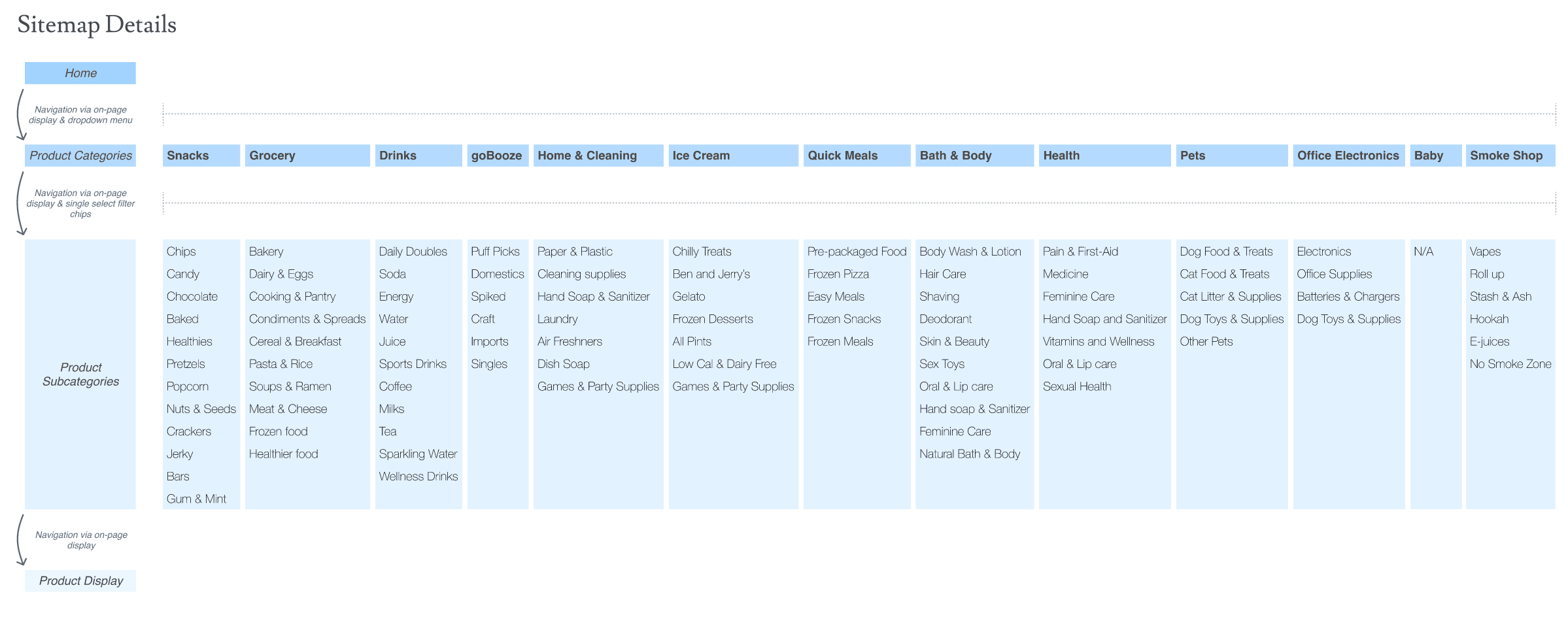
That taxonomy also surfaced a labeling problem: category names like "goBooze" and "Puff Picks" favor brand voice over the terms people actually search for, weakening both information scent for shoppers and how well the page can rank for real search terms.
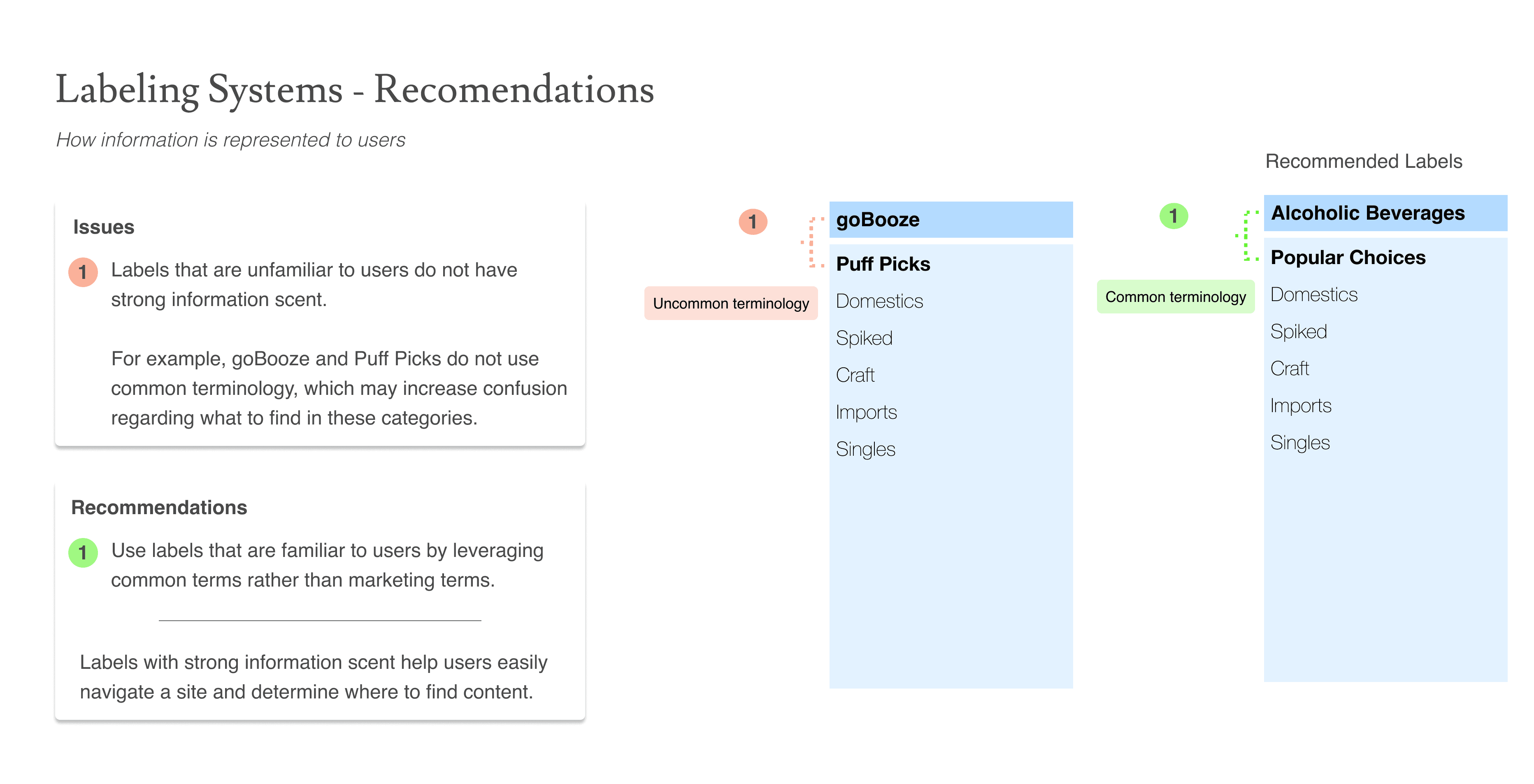
- The category labels "goBooze" and "Puff Picks" don't use terms users actually search for and carry no meaning to a search engine crawler. The updated design renames them to plain, common terms like "Alcoholic Beverages" and "Popular Choices" that tell both a user and a crawler what's there.
After diving deep into the structure and labeling, I then conducted a heuristic evaluation focused on broader usability: global navigation, filtering, and CTA effectiveness (saliency, prominence, readability, and scalability). I assessed four key templates: the homepage, product category page, product grid, and product detail page. Each issue was documented with the associated screen, its impact, and a clear, actionable design recommendation.
Home Page
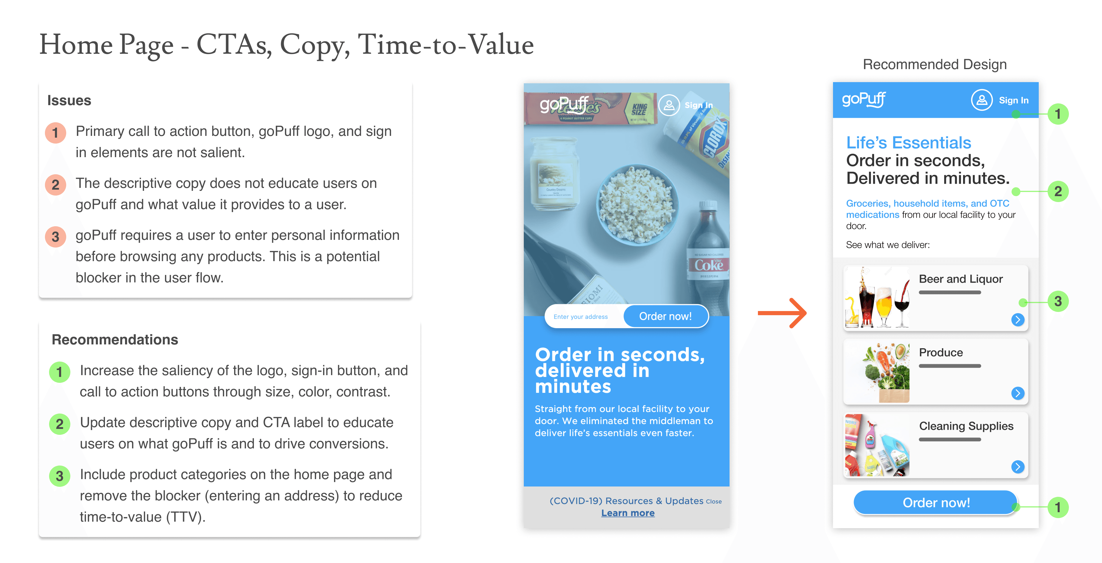
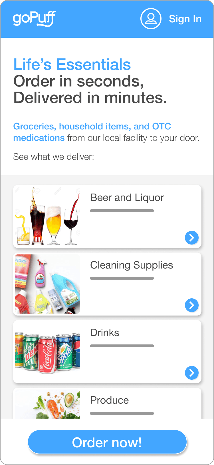
- The primary CTA, logo, and sign-in lacked saliency against the hero image. The updated design increases contrast and size so the CTA, logo, and sign-in stand out immediately.
- The descriptive copy didn't explain what goPuff actually offers. The updated copy leads with the value: what users get and how fast.
- Requiring an address before browsing blocked a new visitor from seeing any value. The updated design surfaces categories directly on the homepage, letting users browse before entering an address and shortening time to value.
Global Navigation
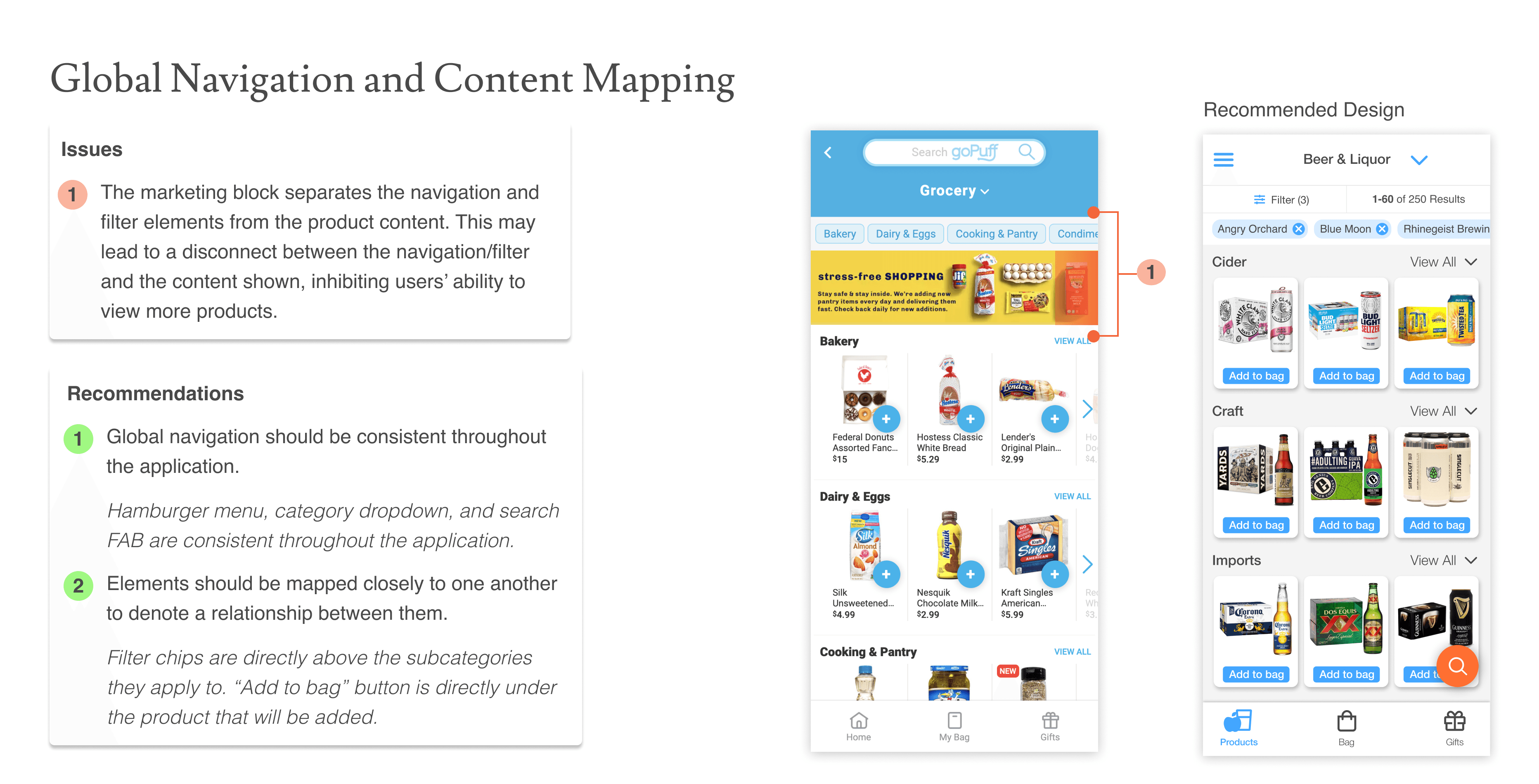
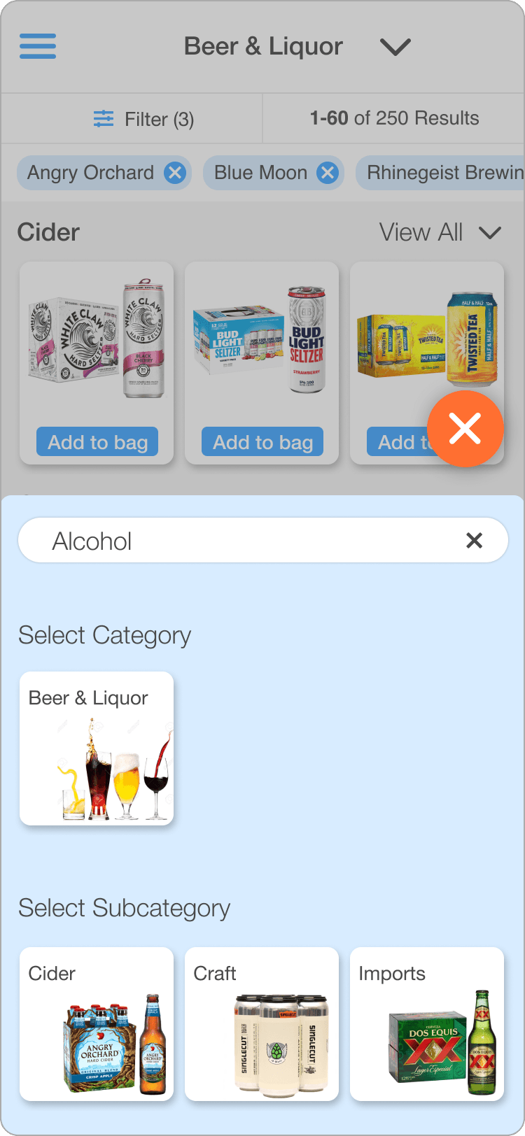
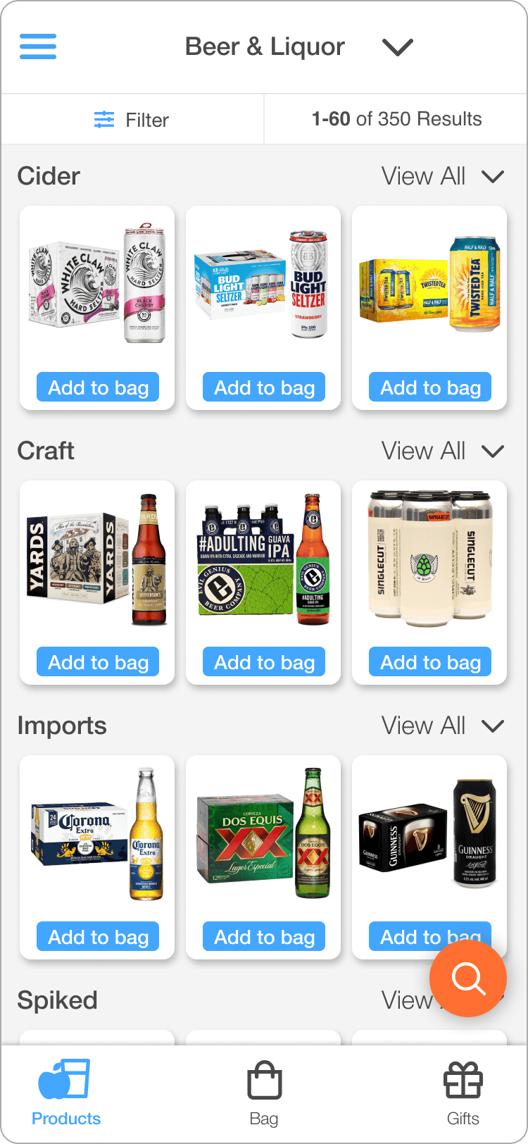
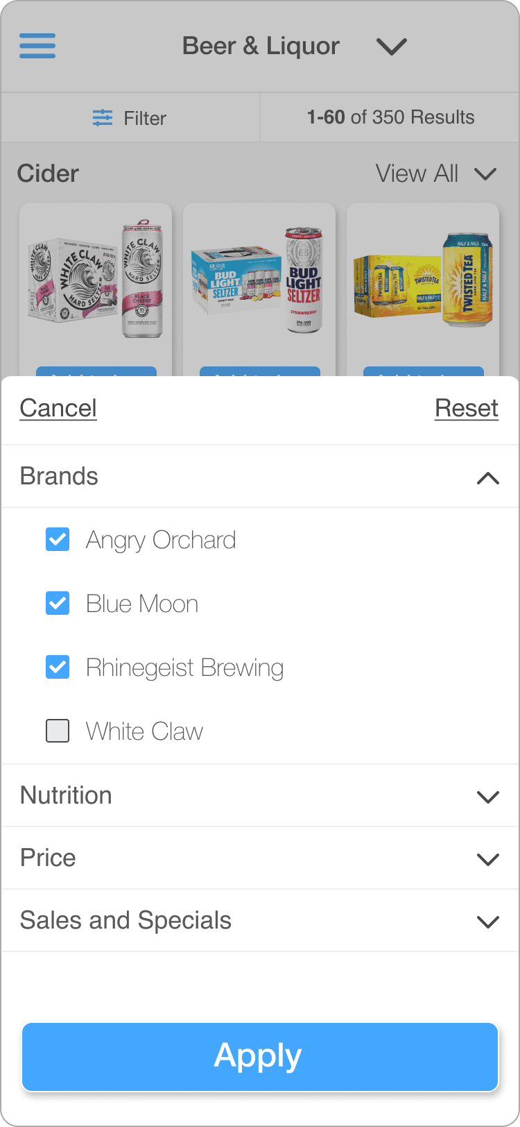
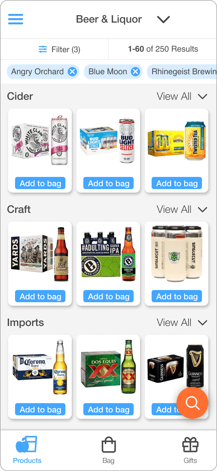
- A marketing block sat between the category filters and the products they controlled, breaking the visual link between an action and its result. The updated design keeps navigation consistent throughout the app and maps filter chips directly above the subcategories they apply to, keeping cause and effect legible.
Product Category Page
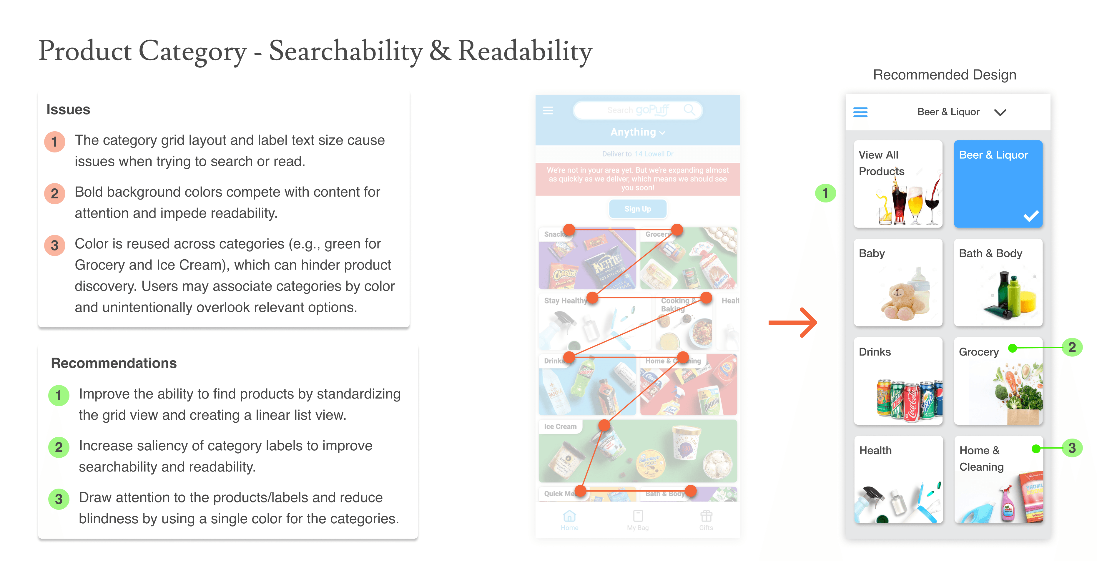
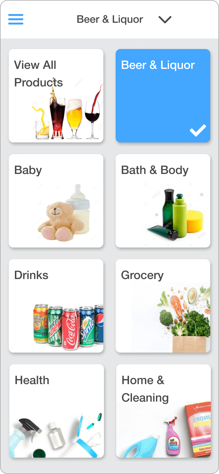
- Category tiles varied in size and layout, mixing horizontally scrolling rows with tiles that fit directly on screen, forcing users to read labels and scan images in an inconsistent, zigzagging pattern that made categories easy to miss. The updated design standardizes the grid to uniform tiles with a consistent background color and no horizontal scrolling, so the eye can follow a clear, F- or E-shaped reading pattern instead, with only vertical scrolling on smaller screens.
- Bold background colors were reused across categories, for example the same green for both Grocery and Ice Cream, so color stopped working as a reliable cue and competed with the content itself for attention. The updated design standardizes the grid to a single color and adds a linear list view, so users scan by label and product instead.
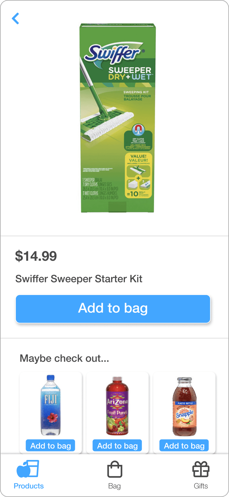
- On product detail pages, the Add to Bag button sat far from the product and close to unrelated suggested items, risking accidental adds. The updated design places it directly beneath the product to remove that ambiguity.
How I Influenced the Team
I paired every high-priority issue with a wireframed recommendation, so the client had tangible visuals of what the recommendation looked like, rather than just the critique and issue. The presentation was solution-focused, which led the client team to stay open rather than defensive, and get excited about the design direction of the changes.
To decide what to tackle first, I ran collaborative prioritization sessions with the client team: engineers and the product owner. Together we mapped every issue on a matrix of impact versus effort. The sessions kept the group focused on two goals: improving usability and making the site easier for search engines to crawl. That focus is what shaped the final priorities, fixes that would lift SERP visibility and, once users arrived, cut the time and steps it takes to go from exploring products to placing an order.
Prioritization matrix
39 issues surfaced across the audit consolidate into these 15 distinct issues, mapped by effort versus impact. Impact weighs reach across users, effect on conversion, and effect on search-engine crawlability.
Select any issue above to see the finding and recommendation behind it.
Outcomes & Impact
Outcomes Delivered
This engagement was scoped as a short project, with deliverables focused on recommendations and wireframes for goPuff's site. Within that scope, I delivered:
- A complete sitemap and 14-category product taxonomy documented for the first time.
- 39 usability issues identified across homepage, category, grid, detail, global navigation, and filtering, consolidated into 15 distinct issues for prioritization.
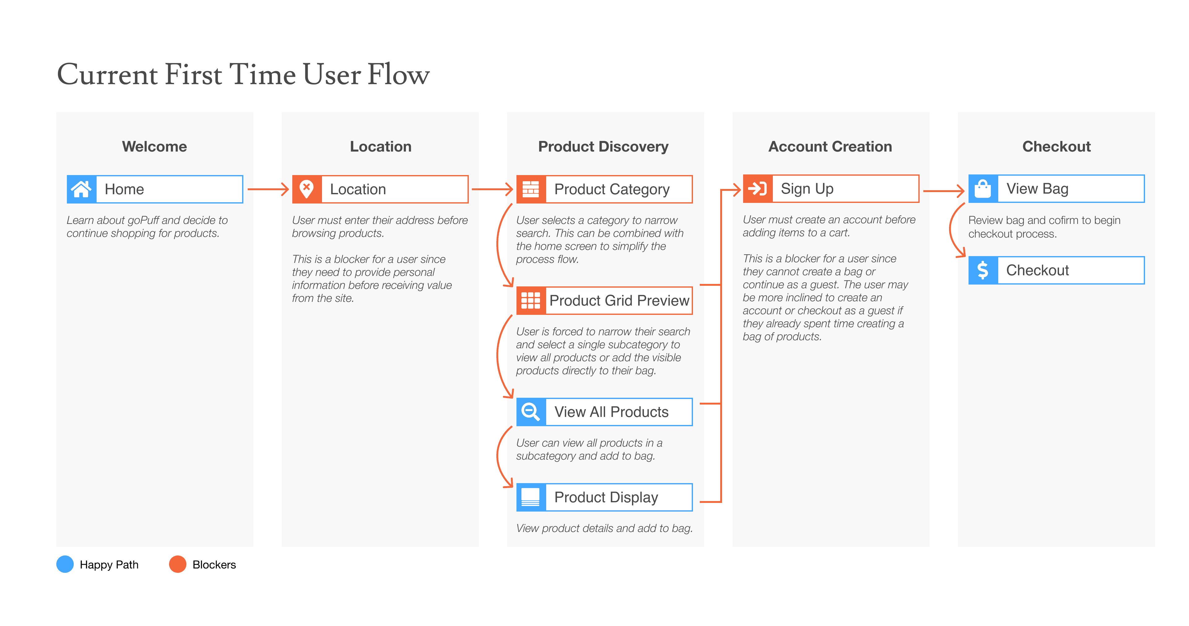
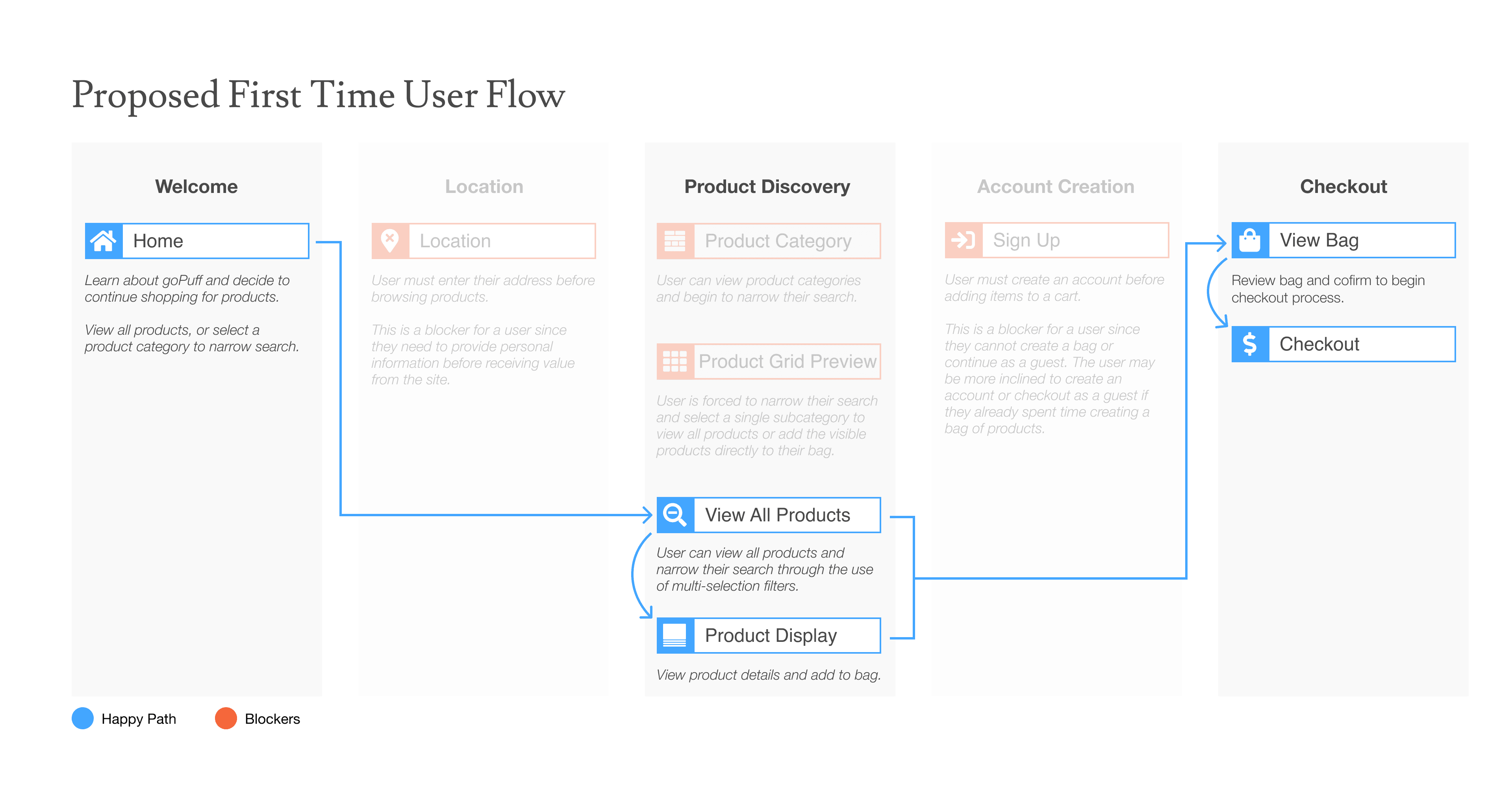
- A revised first-order flow that reduces steps from 8 to 4 by removing location and account-creation blockers.
- Wireframes addressing the highest-priority saliency, navigation, and consistency issues.
The clearest win was time to value. The current flow forces new visitors to enter a location and create an account before they can browse or purchase products. The proposed flow removes both blockers: a new user goes straight from the homepage to browsing all products, cutting the path to a first order from 8 steps to 4.
Recommended wireframes based on heuristic evaluation
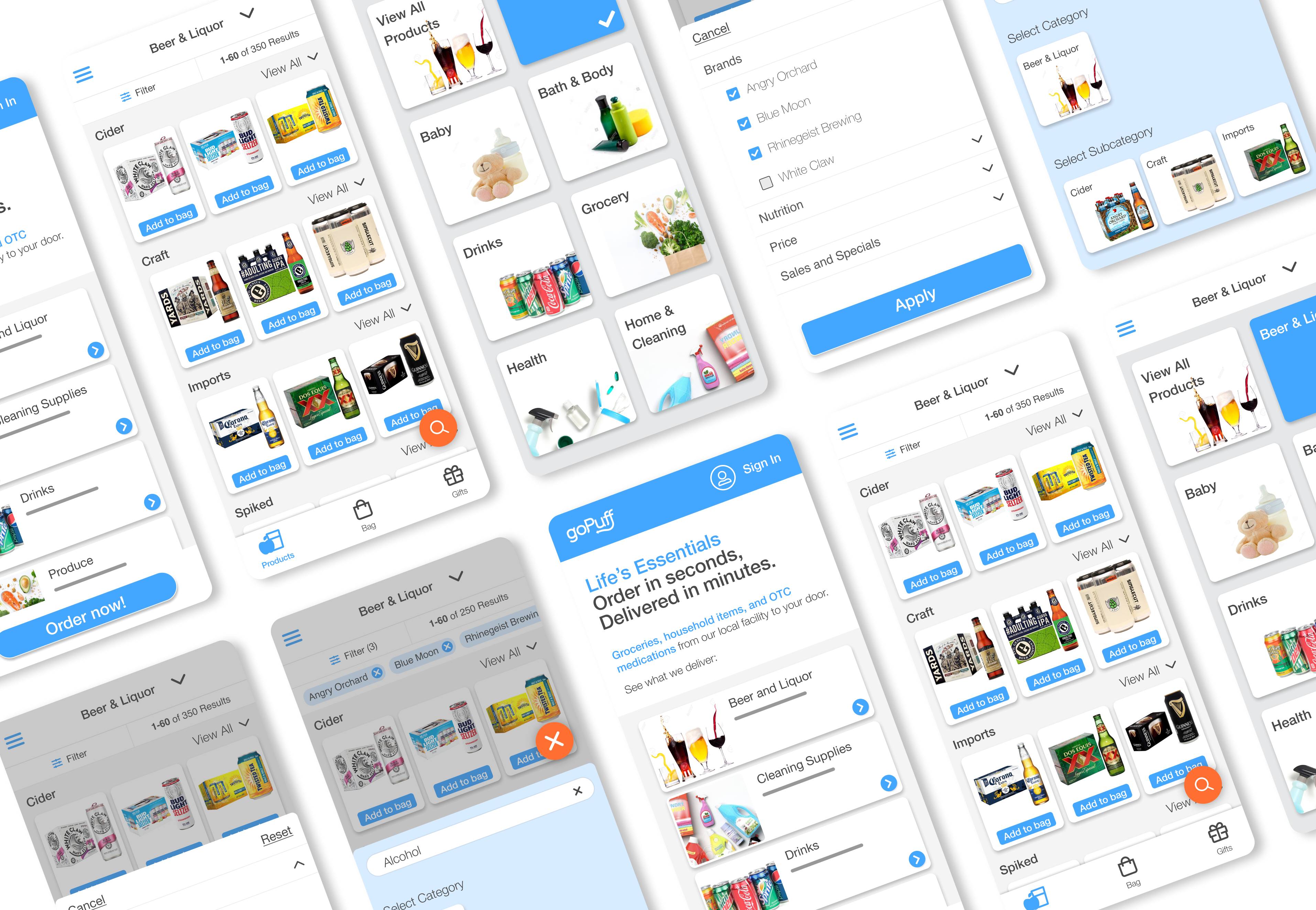
Seven mobile screens for the end-to-end flow from the home screen through category selection, filtering, and product detail.
How I Would Measure Impact
If extended beyond the initial scope, these are the steps I would take to de-risk implementation and measure impact:
- Run experiments: Set up a pre/post or A/B test against the current experience and run it long enough to get a stable signal beyond the launch period.
- Usability: Measure task success rate and time on task for the new first-time flow, benchmarked against the existing 8-step path.
- Search performance: Track rankings for high-intent terms (for example, "alcoholic beverages") and organic click-through rate to validate that the new plain-language labels improve visibility.
- Conversion: Monitor first-time visitor-to-first-order conversion, with specific focus on the redesigned homepage-to-product-grid path.
- Post-launch benchmark: Run a follow-up usability study a few months after launch to confirm that improvements hold and to identify any new friction.